Hi, I’m Amie.
Amie with an ‘ie’.
‘i.e.’ is an abbreviation of the Latin phrase id est, meaning ‘that is to say’ or ‘in other words.’ It signals that an explanation or clarification is coming. As a graphic designer, my role is to visually communicate ideas with clarity and purpose—in other words, to interpret the world and translate it into meaningful, engaging visuals that connect with an audience.
With degrees in Graphic Design and Anthropology, I bring a human-centered approach to visual communication, informed by audience behavior and strategic storytelling. I have extensive experience creating cohesive brand identities and campaigns for educational and public outreach efforts focused on awareness and behavior change. I enjoy solving complex communication challenges and take pride in producing work that is both visually engaging and purposeful, across branding, print, social media, UI/web design, and animation.
Public Outreach Campaigns
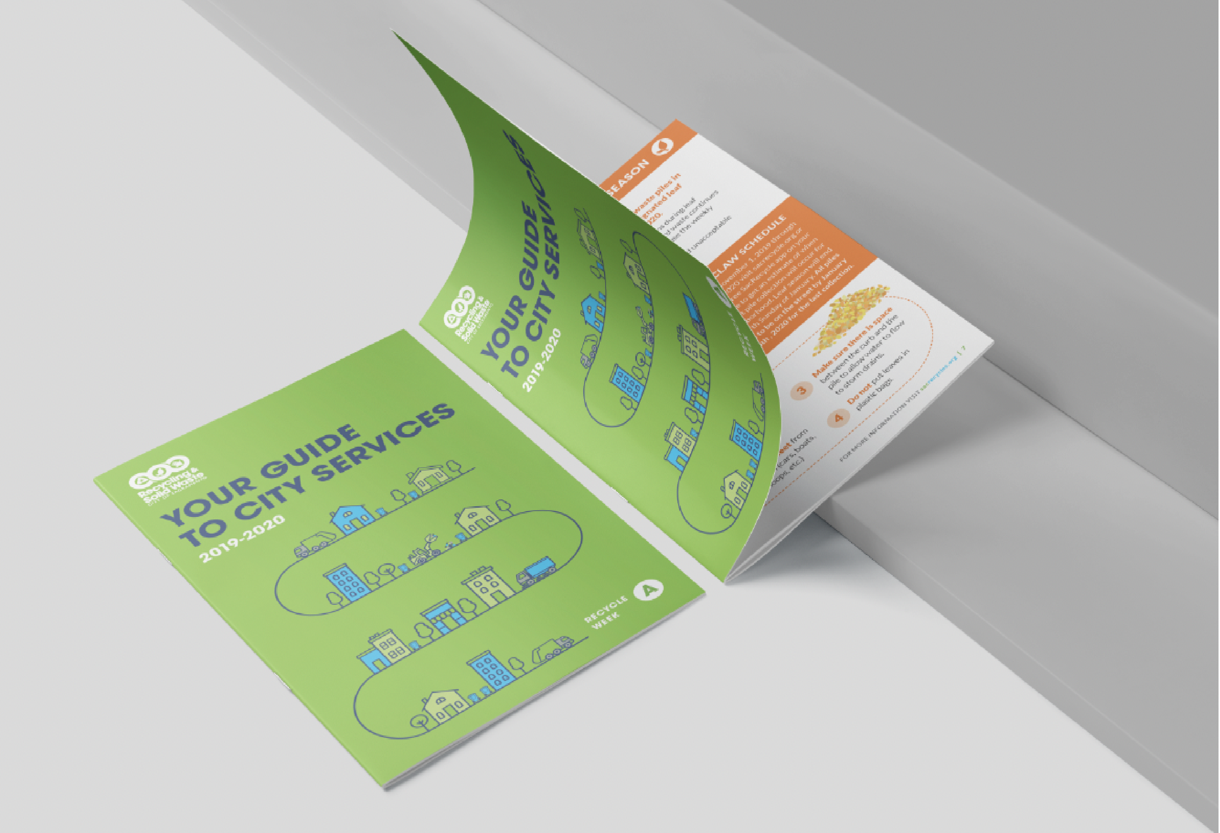
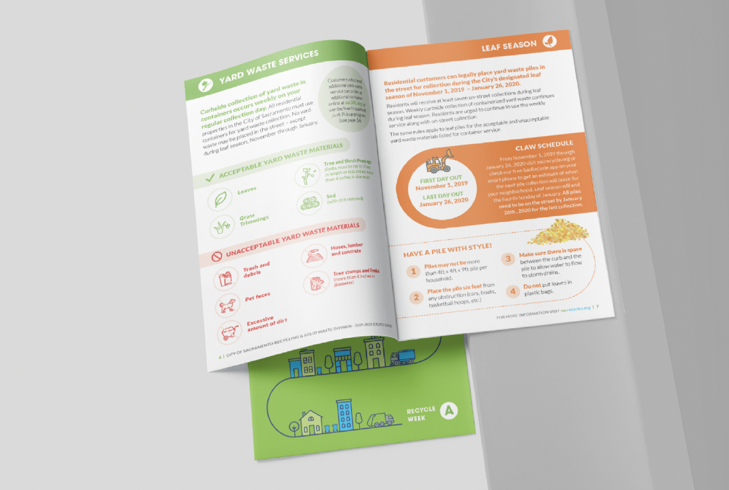
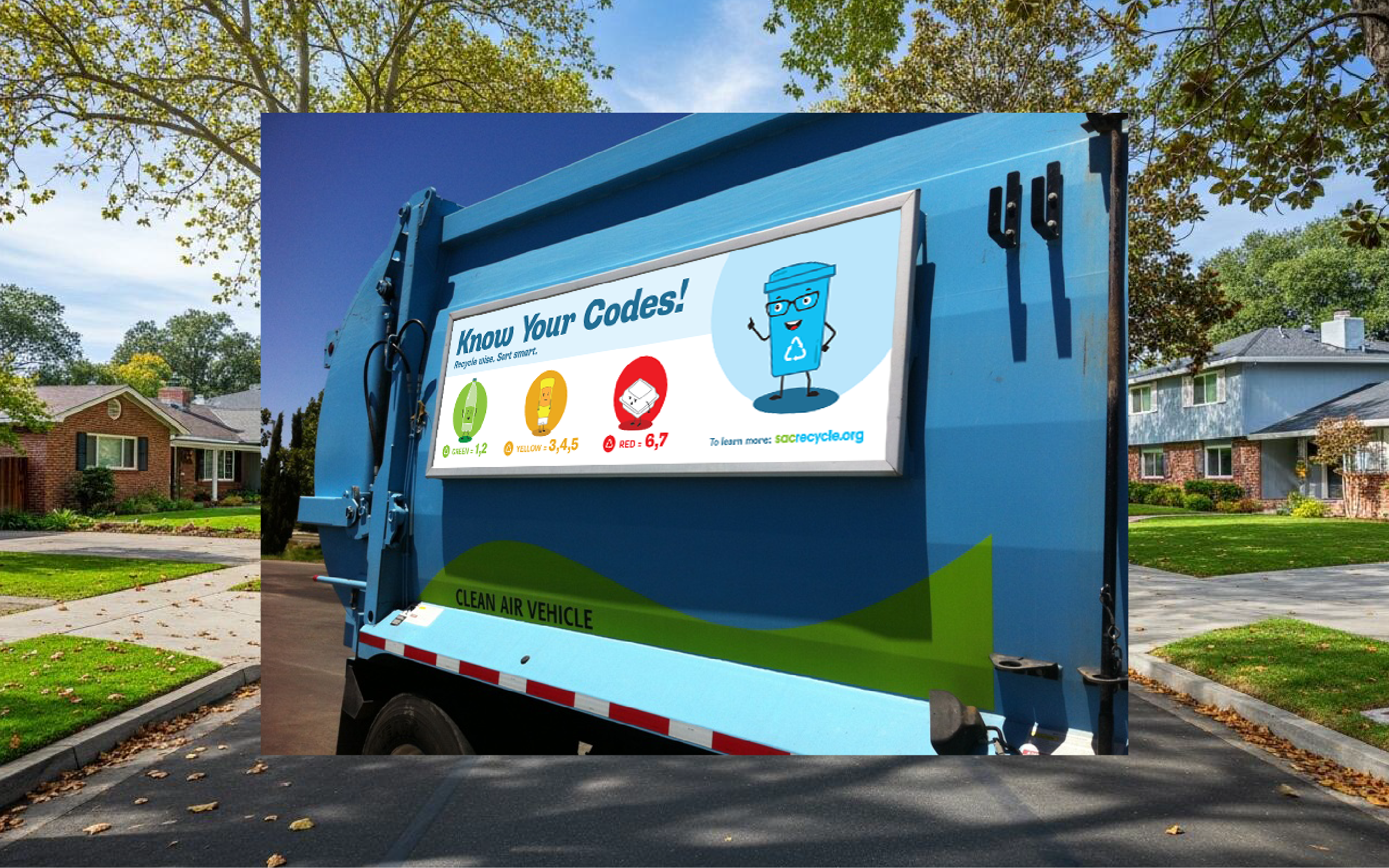
SacRecycles
The City of Sacramento’s Solid Waste Division launched a dynamic, multi-channel campaign to transform how residents think about recycling. The goal: boost recycling compliance, cut contamination, and inspire smarter, everyday habits.
A major focus of the campaign encouraged residents to use their green waste carts for leaf disposal—helping keep streets clear, protect local waterways, and reduce neighborhood clutter.
The initiative came to life through a full redesign of the service guide—produced in six languages—paired with bold truck signage, engaging mailers, and a lively PSA animation promoting proper recycling practices. To make the message truly resonate, a cast of bright, friendly, and approachable characters was created—turning an otherwise routine topic into something memorable, relatable, and fun.
CalMod
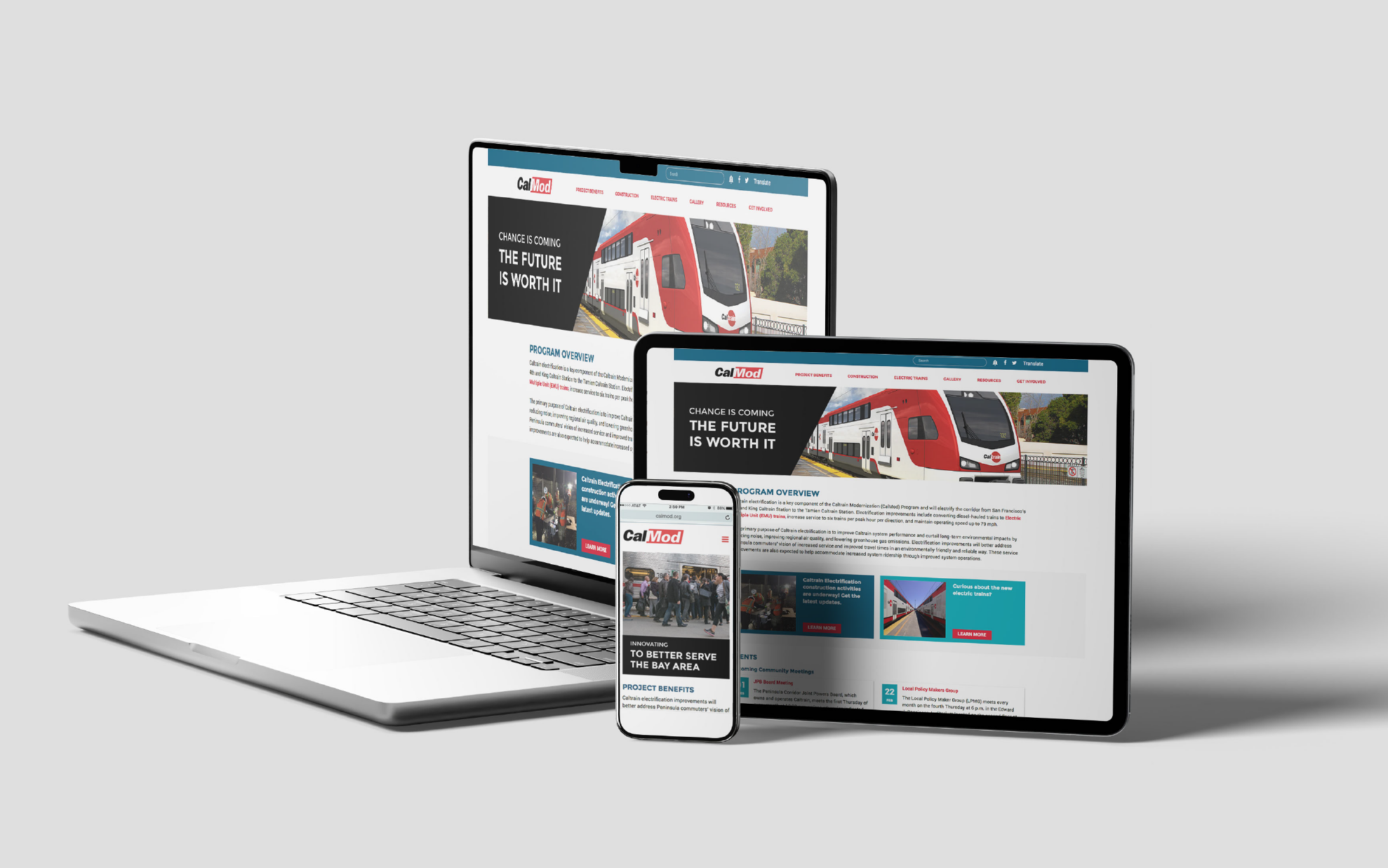


Caltrain’s electrification project—known as Caltrain Modernization (CalMod)—transformed its fleet from diesel to electric, marking a major step toward a faster, cleaner future.
The expansive campaign brought the program to life through cohesive logo development, social media, and UI/web design, along with a safety-focused PSA to educate the community about the new overhead power lines. The project also included exterior design prototypes for the new train fleet, inviting public input through a poll to help select the final design. An immersive VR experience further engaged the community, offering a firsthand look at the train interiors.
A bold visual system—featuring sharp angles, bright starbursts, and friendly characters—captured a sense of speed, innovation, and optimism for Caltrain’s next chapter.
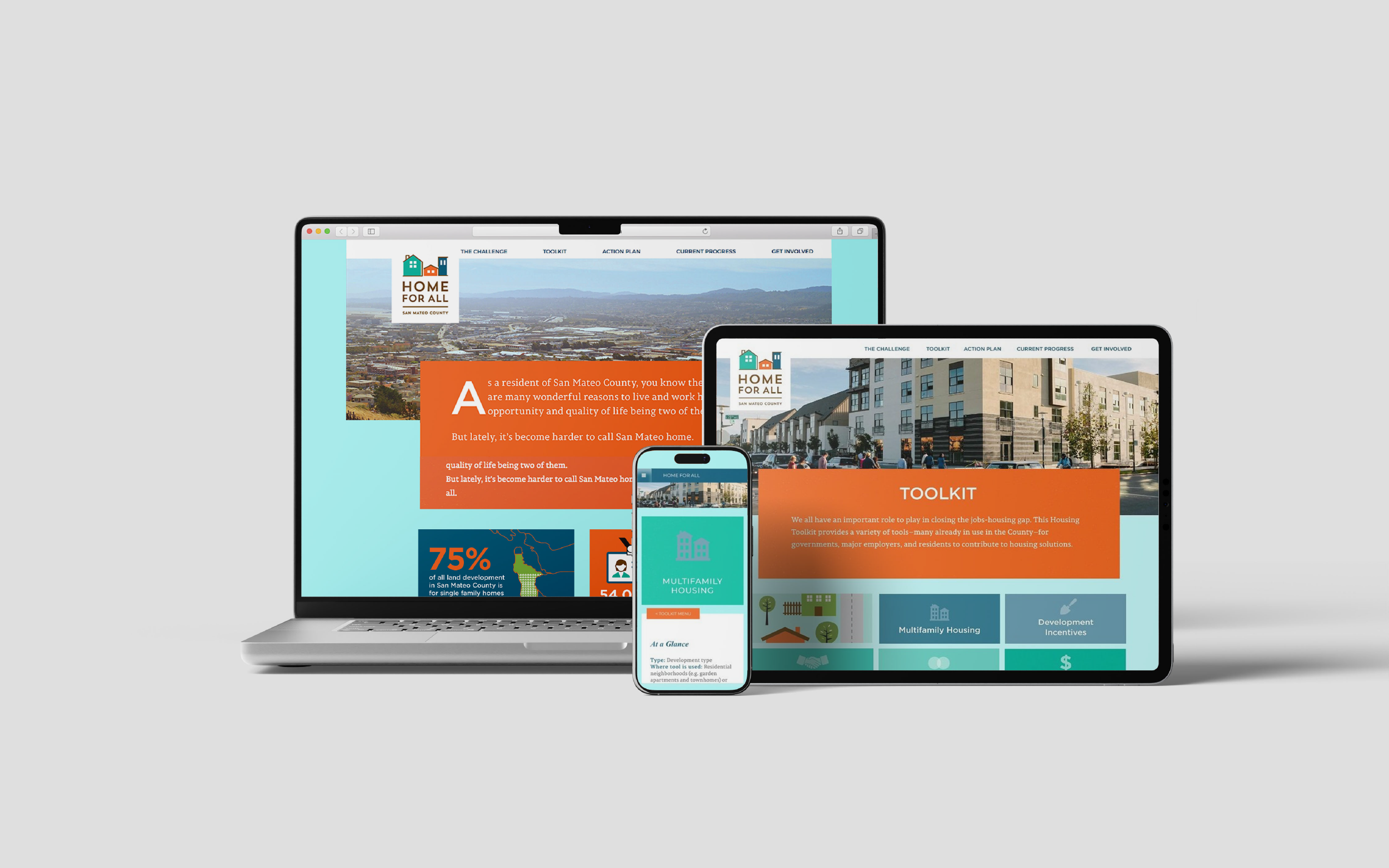
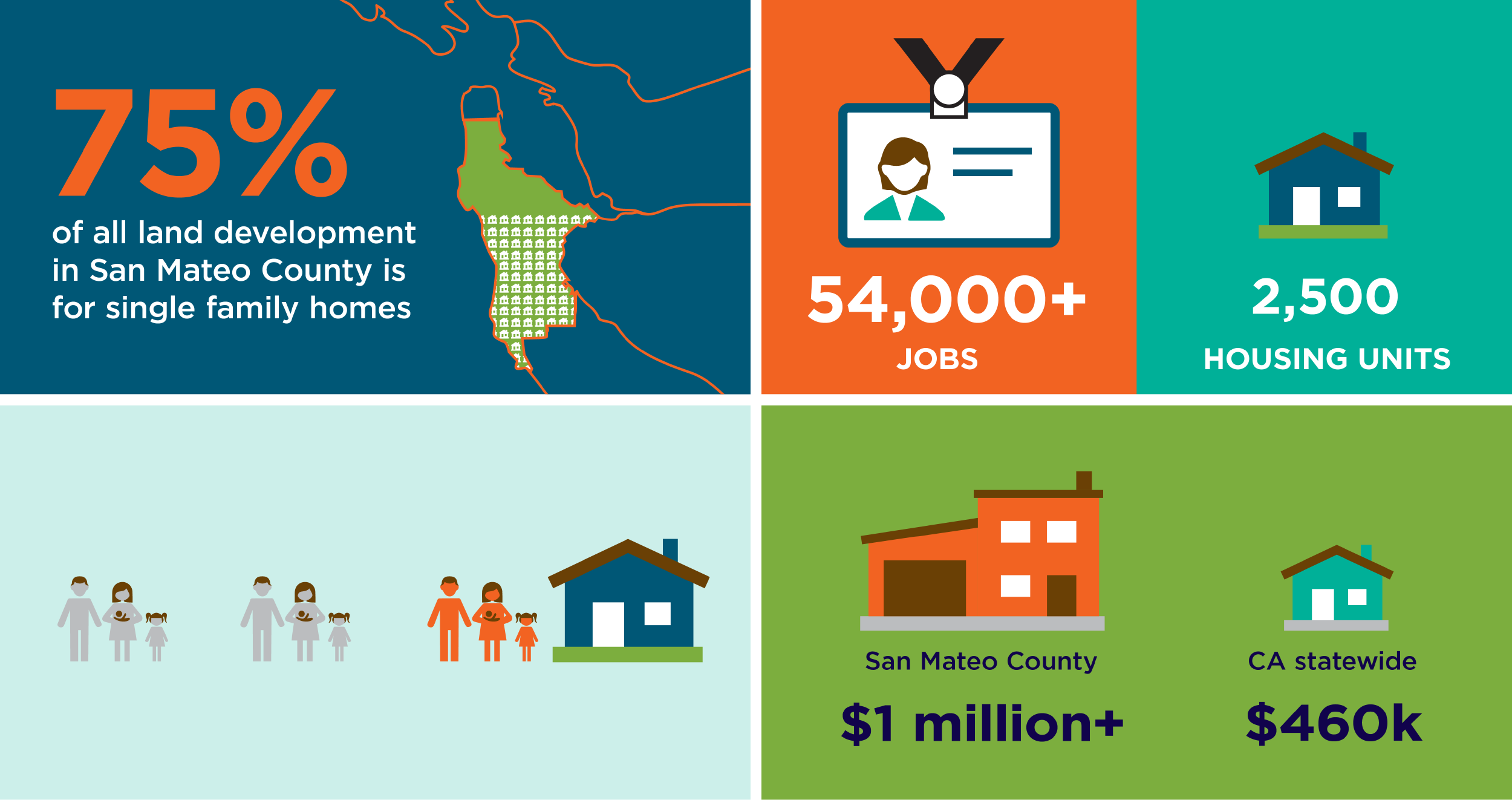
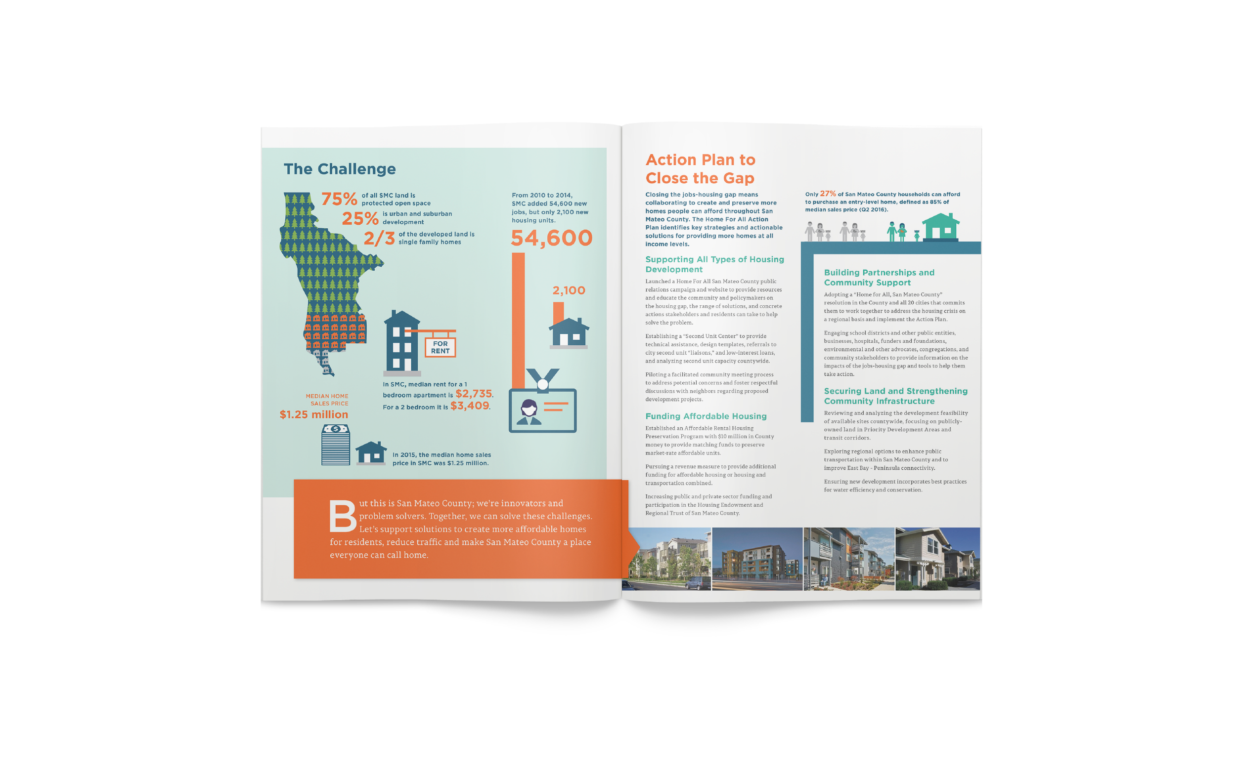
Home For All
Home for All San Mateo County advances a range of solutions to address the root causes of homelessness and expand housing opportunities at all income levels—working toward a community where everyone has a place to call home.
To support a public education initiative and raise awareness of available services, the campaign included a logo, website, social media graphics, and printed brochure. An engaging color palette and approachable infographics helped clearly communicate the program’s goals and impact.
Mt Diablo Wetlands Fund
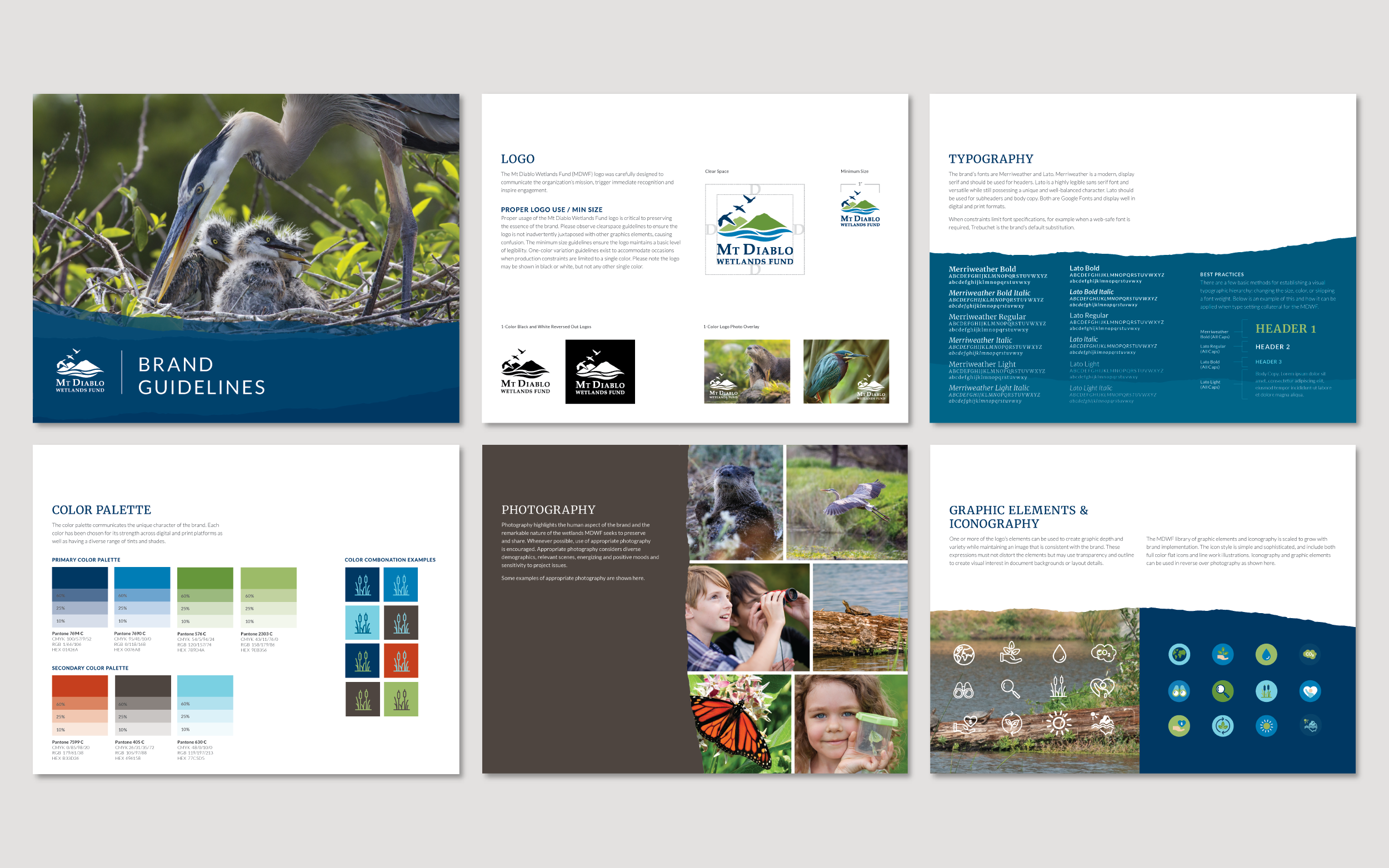
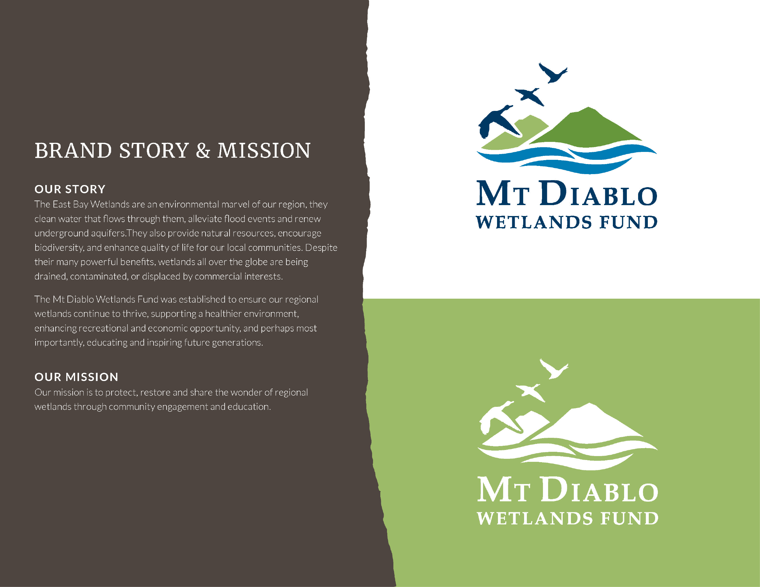
The Mt. Diablo Wetlands Fund needed a brand identity that could capture the full scope of its mission—protecting and restoring regional wetlands, supporting environmental health, expanding recreational and economic opportunities, and inspiring future generations.
The solution included a comprehensive identity system with logo design, brand guidelines, and a website built to drive community engagement through volunteering and donations. A natural color palette of rich earth tones—browns, greens, warm oranges, and deep blues—paired with immersive photography, reinforces the organization’s connection to the landscape while bringing clarity and warmth to its educational mission.
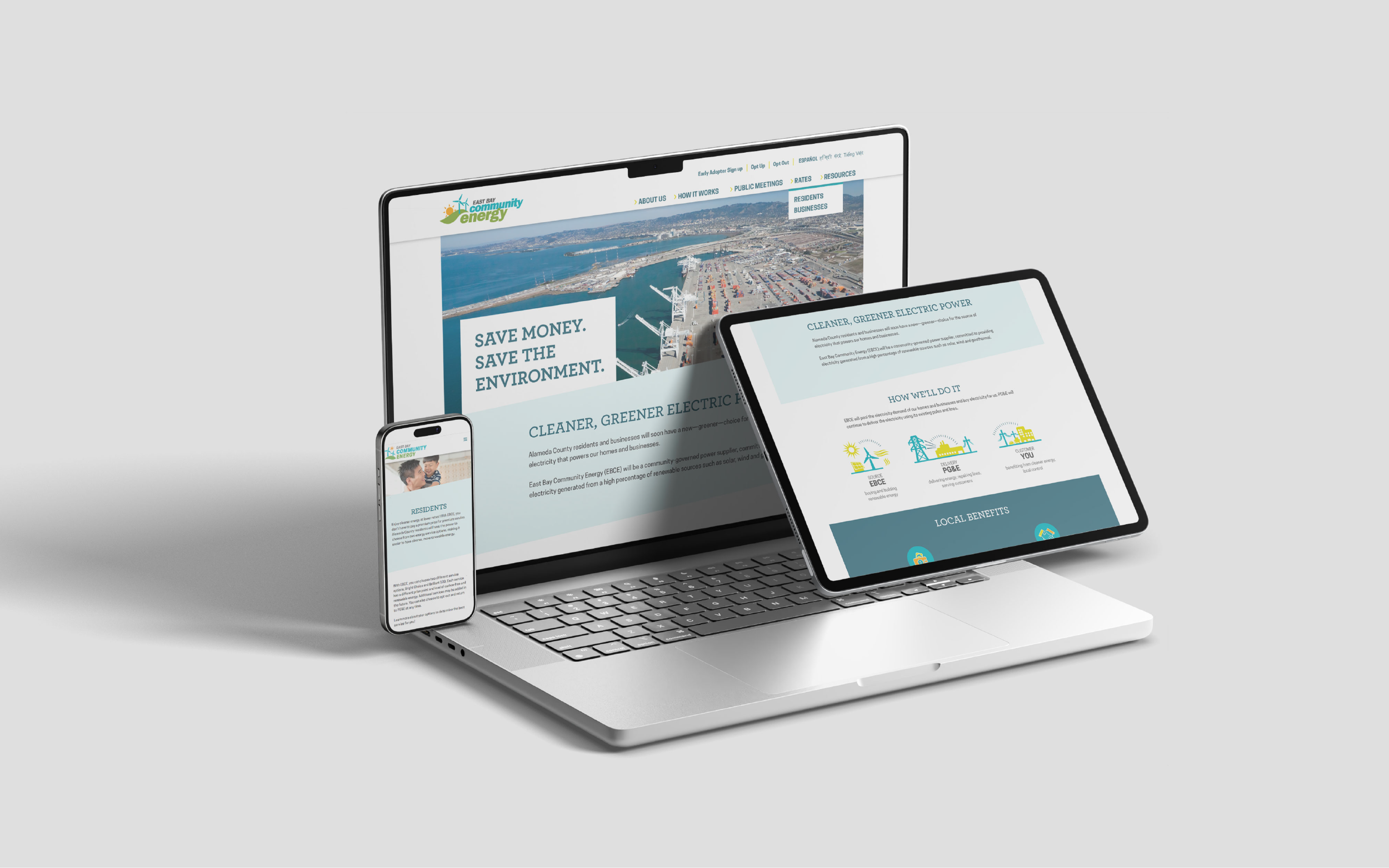
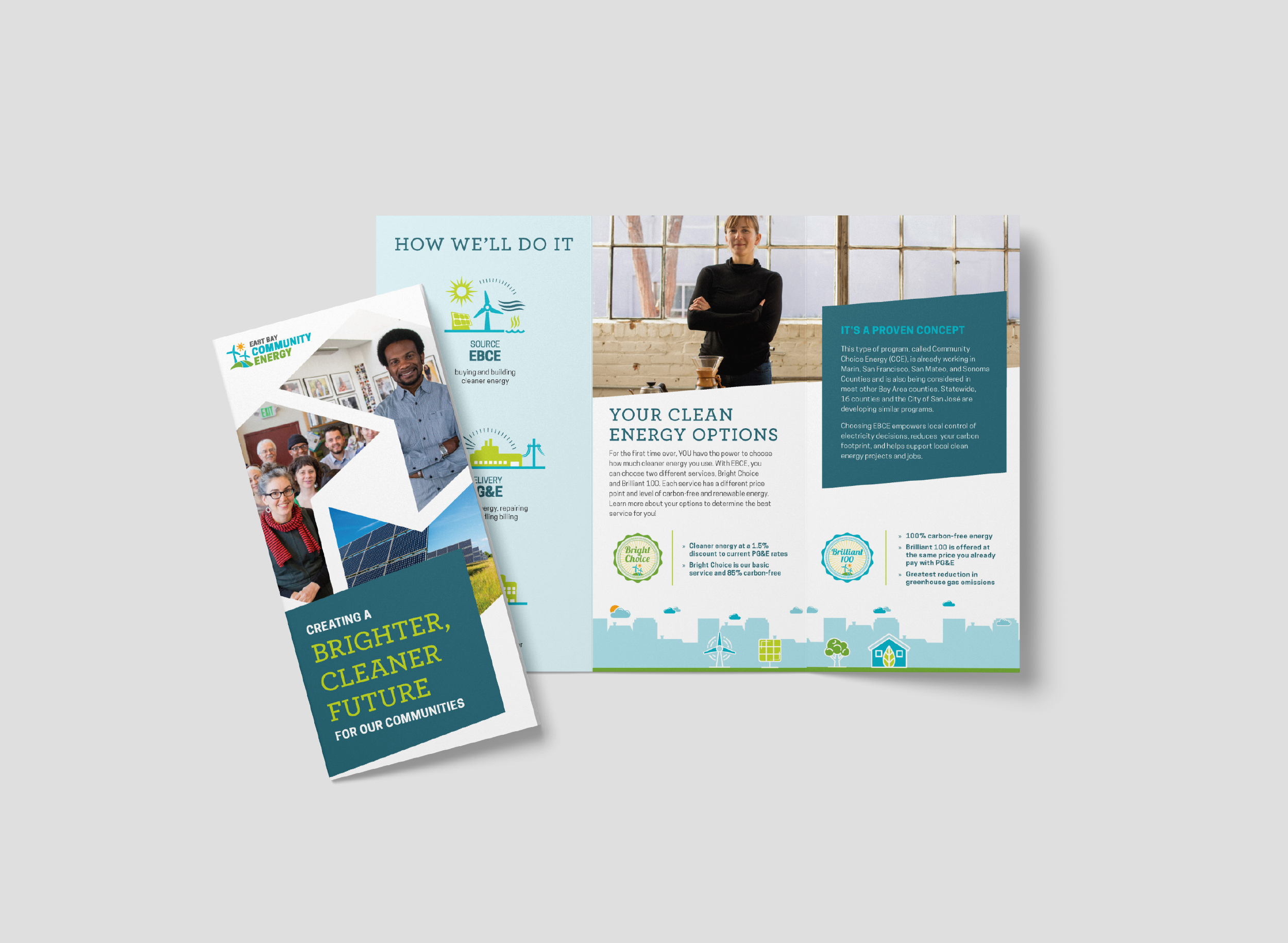
East Bay Community Energy
Ahead of launch, EBCE needed a brand that could simplify complex energy concepts while building trust and excitement within the community.
A comprehensive brand identity and integrated marketing campaign was developed to drive awareness and early customer engagement. The work included a redesign of the primary logo, creation of sub-brand product logos, and development of customer outreach materials and website design. A PSA animation was also produced to promote program services.
A vibrant palette of chartreuse yellow-green, light blues, and rich teals reflects the program’s commitment to clean energy, while friendly, inclusive characters make the brand approachable and easy to understand. The result is a cohesive and engaging brand that positions EBCE as an accessible, community-focused clean energy provider.
Selected Projects
-
![]()
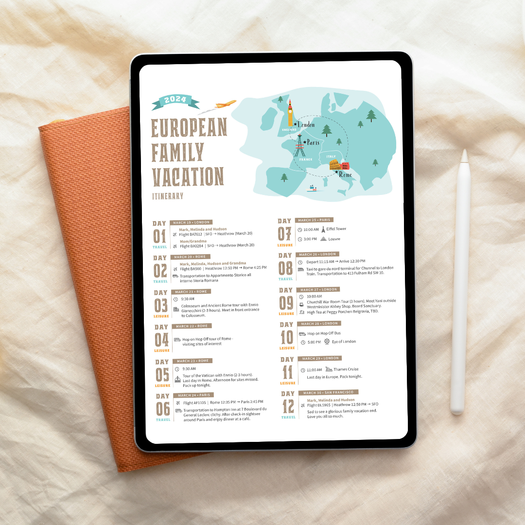
Personalized Vacation Itinerary
-
![]()
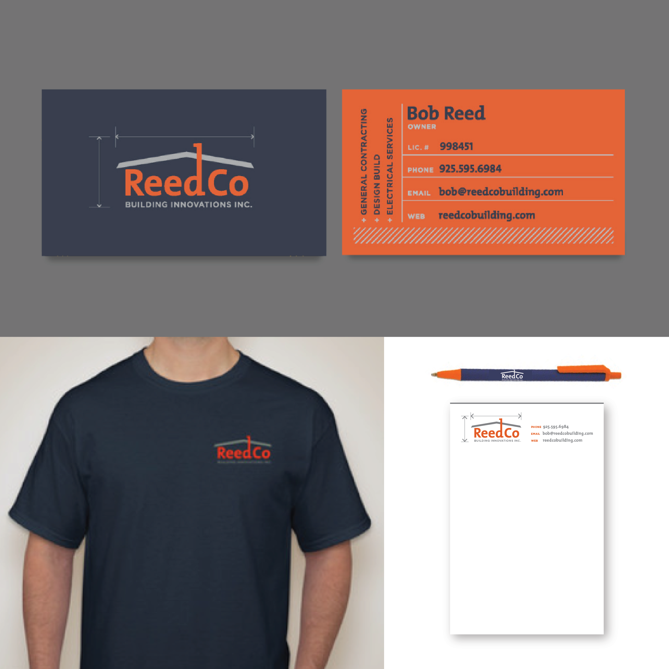
Reed Co Logo & Brand
-
![]()
Event Logo & Save The Date
-
![]()
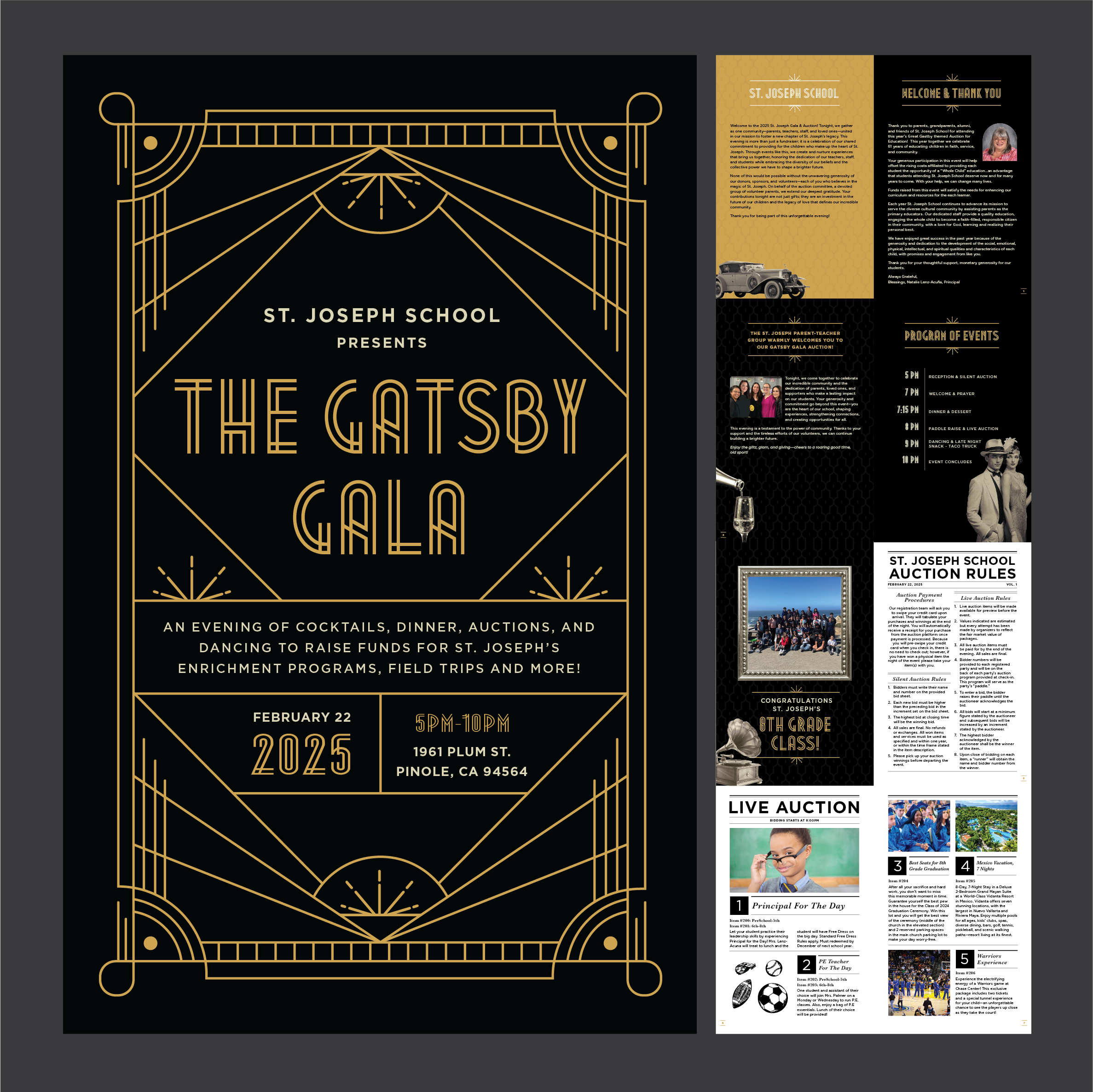
Gala Auction Booklet
-
![]()
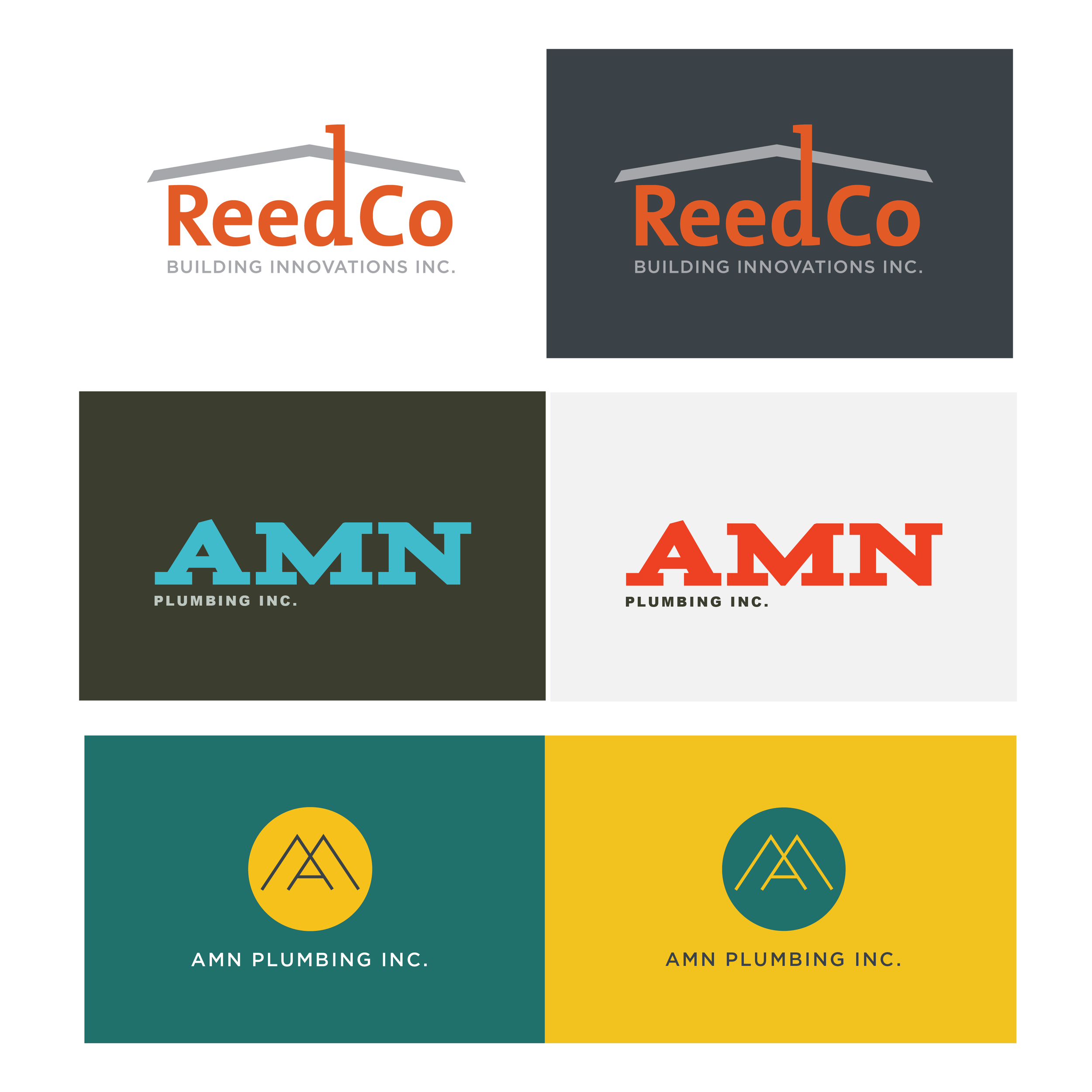
Logo & Product Branding


Logos
-
![]()
Industrial Service
-
![]()
Medicinal
-
![]()
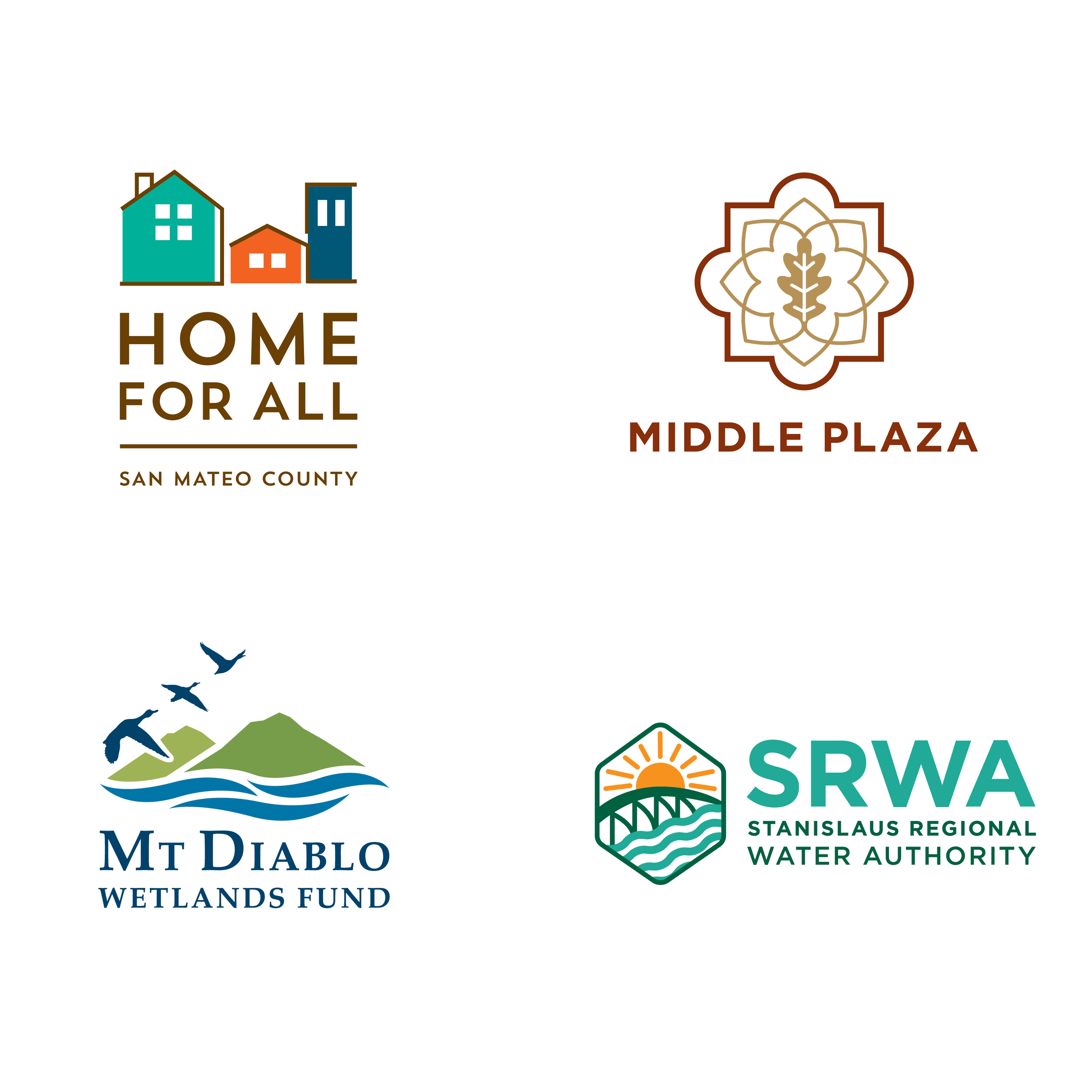
Community Planning and Sustainability

Experience
Graphic Designer
Lewis & Williams, Napa, CA
Oct 2005 - May 2007
Designed interpretive panels and graphics for state parks and trade shows. Prepared files for print production. Designed furniture and exhibit displays using AutoCad program.
Graphic Design Intern
WildAid, San Francisco, CA
Mar 2011 - Mar 2012
Creative director for WildAid’s first annual gala. Provided marketing material for international campaigns in China.
Senior Graphic Designer
Circlepoint, Oakland, CA
Mar 2012 - Feb 2023
Provided graphic design assistance for educational and public outreach campaigns for the public sector and city agencies, including transportation, land planning, water, energy and utilities, health, sustainability, climate change, and waste management.